By Your Crypto Boss on The Capital
The main tool in the arsenal of any trader, from the beginner to a professional, is technical analysis. Most of the materials in the network, trading ideas, and strategies are devoted to the study of technical analysis. The search for the ideal market entry and exit of point, trend direction, trading robots, and much more is based on technical analysis. A century ago, the first traders-researchers made various parallels between the price behavior and psychology of market participants, finding coincidences and making notes, they were able to predict the further movement of stocks and commodities prices accurately enough. The result of their work was the appearance of technical analysis, indicators, and trading strategies that still work today.
One of the founders of technical analysis is Charles Dow, co-founder of The Wall Street Journal, a well-known publication about the world of trading exchange and the industrial index of American companies Dow Jones. Dow put forward the fundamental principles of the technical analysis, which are still working today, even helping the “greenest” traders to learn the profession of a trader, by analyzing the chart of the asset value. For the moment, we’re not going to study in detail the 10 principles of Charles Dow, but going directly to the concrete examples for using those analysis.
Graphic analysis
Graphic analysis is the search for certain patterns that signal a continuation or reversal of a trend. These patterns form other patterns that can be easily found in a chart. Let’s look at the most popular of them and let’s find out why they are formed.
“Double and triple top/Bottom”
The formation of the figure double or triple top/bottom is the result of the fact that market participants failed to overcome a certain price level twice or three times, having dialed a good acceleration before trying to break down. This figure is considered to be a reversal model, i.e. due to its formation, there is a trend change. If we speak about the figure “Double top/Bottom,” the letter W or M is formed in the chart.
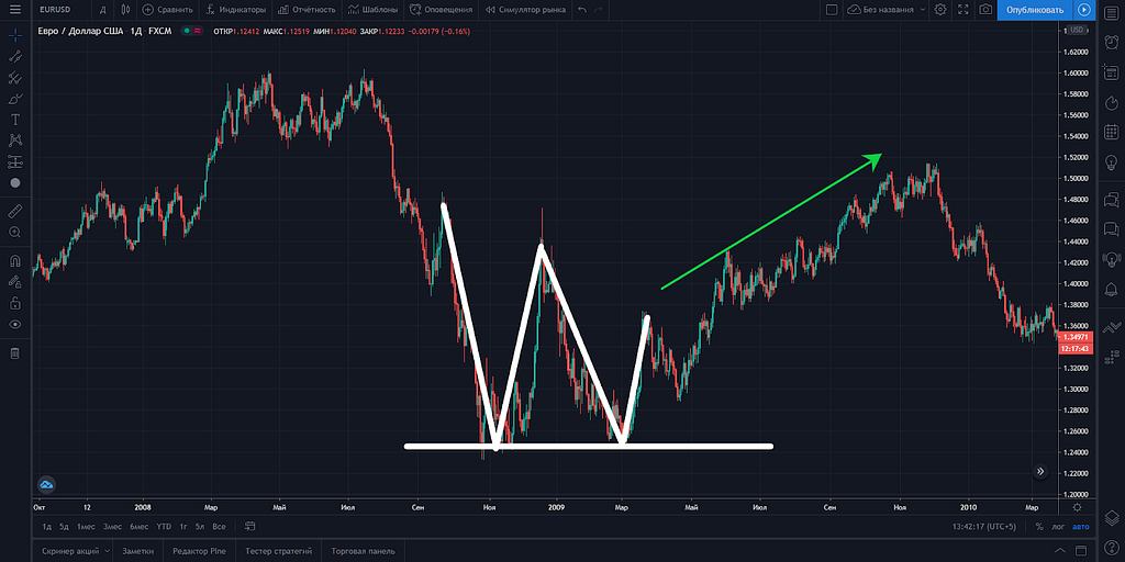
The “Triple Top/Bottom” is formed either in the same way, when market participants cannot overcome the same level three times, or in the case when each next growth attempt fails to reach the previous maximum. As a rule, after the third attempt, the value collapses if the price has risen before, and conversely. It is best to practice these figures on large timeframes: 4 hours or a day.
“Flag (pennant)”
One of the most popular graphic analysis figures is “Flag” or “Vympel.” There is no principal value in the name of this pattern, as there are no strong differences between them. However, unlike the figure “Double or triple bottom/bottom,” this pattern is worked out much less often — in 50% cases, or even less often. The fact is that it is a pattern of trend continuation in the short term, for example, during impulse growth or decline.
After completion of a strong impulse movement, as a rule, the price stops for some time and trades in the sideways. This indicates that some traders have made a profit and left the market, while the other part is gaining or strengthening positions waiting for the continuation. As soon as the balance outweighs the majority, the movement (on the screenshot it’s a drop) continues.
Most often the figure “Flag” or “Pennant” doesn’t work out for 2 reasons:
1) Participants didn’t have the strength to push the price further.
2) Falling or growing is over.
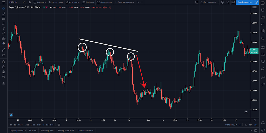
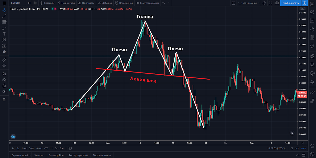
“Head and shoulders”
The pattern “Head and Shoulders” is considered as a strong reversal figure, which indicates a change of trend after a bull or bear rally. Pay attention to the screenshot below. Reaching the head from the left shoulder there is a decrease to the level of “Neck,” after which there is an attempt of new growth if the strength of buyers is at the end, then in the case of a bounce from the right shoulder, whose level usually coincides with the left shoulder, the price moves again to the line “Neck.” In case of the “Neck” breakthrough on high volumes, you can open the short position as the trend has changed.
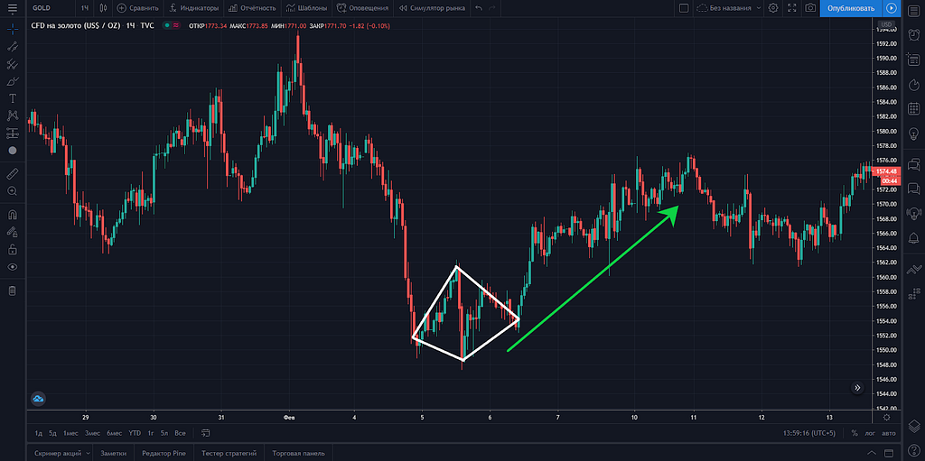
“Rhombus or diamond”
A rhombus or diamond is a rather rare figure of graphic analysis, however, as a rule, its appearance threatens to change the current trend and turn around. Usually, it is formed in the period when there is an active struggle between bulls and bears. If after the pullback the bears did not manage to squeeze the price lower, even updating the minimum, the probability of trend reversal in the short and medium-term is quite high. Most often the figure is worked out. The higher the timeframe, the more chances for a trend reversal.
Price Levels
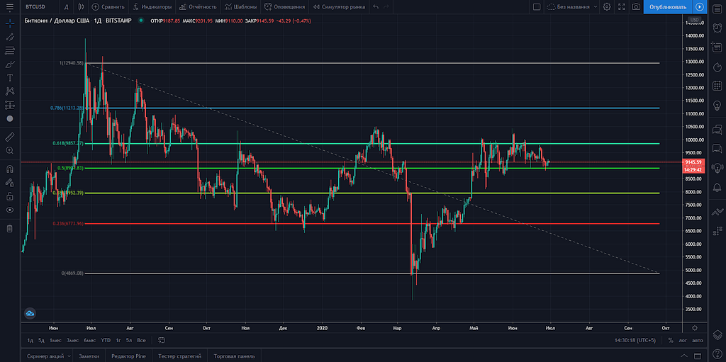
The most accurate and popular today is the analysis of the price levels, support search, resistance, and correction lines, which have strong historical value. For example, the price has been kept from going up or down several times.
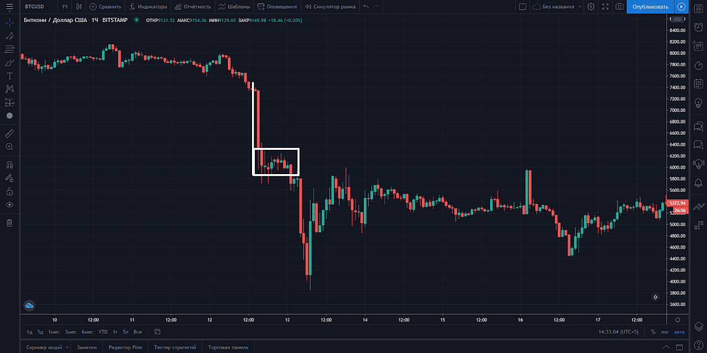
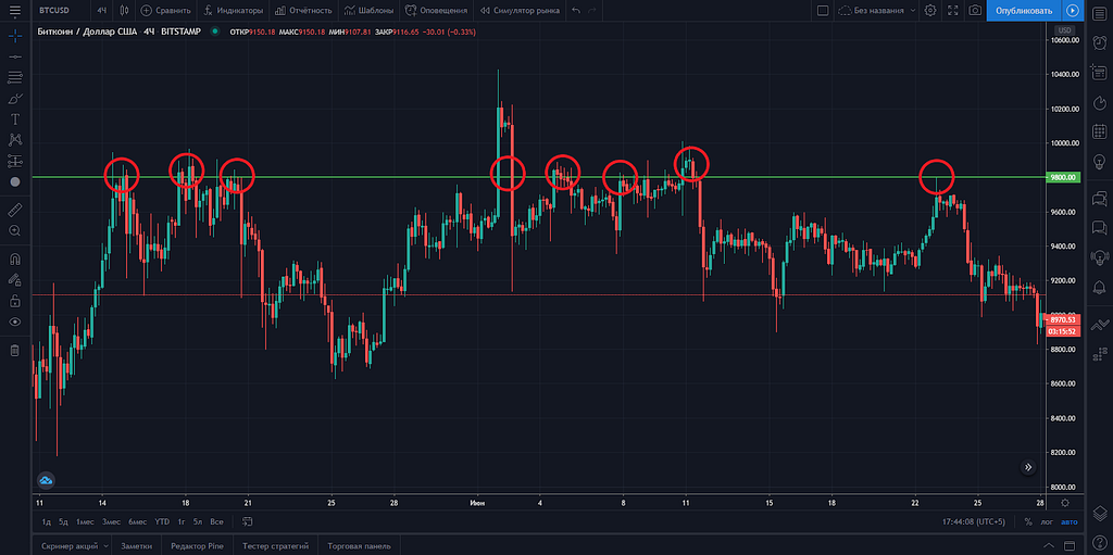
On the following screenshot, you can clearly see how the price of $9800 for the BTC/USD pair repeatedly acted as resistance, which didn’t let the price to rise higher. Very often, traders are becoming victims of a false break-down when the level seems to have been broken, but the price reversed and started to fall. In such cases, it is recommended to wait for several hours after the actual break-down. If it really happened, further movement will be enough to make profit.
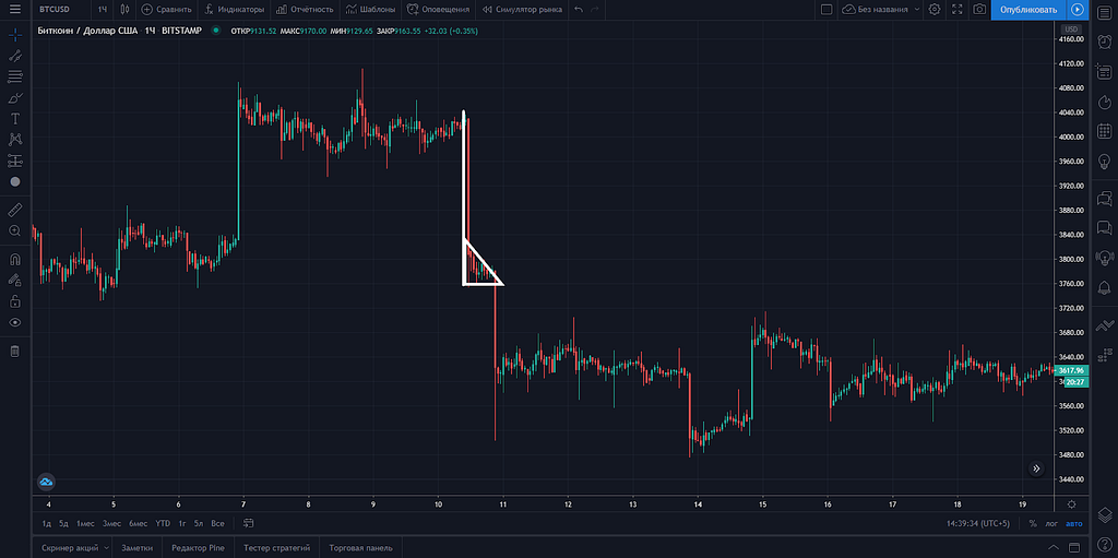
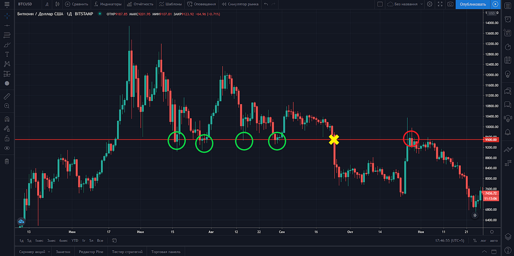
An example of such a break-down can also be seen on the BTC/USD chart when the price has only 5 times passed the $9500 level down. More than a day passed after the impulse break-down, then the price tried to return above $9500, but without success. Immediately after an unsuccessful attempt to return above this level, you could open short positions, which led the bitcoins to $3700 in March 2020.
The Fibonacci retracement levels
If you are not yet able to set the price levels by yourself, we advise you to use the Fibonacci correction levels, which reflect not only upon the key support and resistance levels, but also the intermediate ones. Fibonacci is stretched simply enough, it is necessary to take last maximum and to stretch lines from it to last minimum. Note that the stretching comes from the close price or the body of the candlestick, not from the shadow of the candlestick. This simple rule is explained by Charles Dow himself, in one of the ten principles of the technical analysis and sounds like this:
"Close prices are considered as a confirmation of the market's intentions. This is because close prices are positions that market participants believe are strong enough to carry over to the next day."
The chart clearly shows how prices, sometimes with a small deviation, clearly follow from level to level.
-Levels 0 and 1 are considered overbought and oversold zones. As a rule, the price does not stay there long. If the price comes to these levels again and breaks through them, it is most likely that there is a global change of trend or the beginning of the rally. For example, if Bitcoin rises above 13,000 and breaks through level 1 of Fibonacci, it means a new bullish rally has started.
-The levels of 0.236 and 0.786 are considered intermediate and quite weak.
- The main trade and battle between bulls and bears take place between levels 0.382, 0.5, and 0.618.
Indicators
As computer and automated trading developed, various indicators began to appear, which instantly calculate and show some average price values based on historical data.
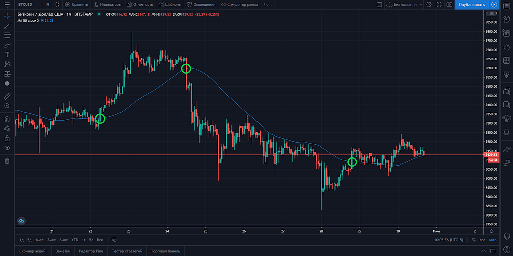
Moving Average
MA or moving average shows the average price value for the specified period. For example, if you use an hourly timeframe and specify a period of 50 in the MA settings, the line will show you the average price for the previous 50 hours. Some simple trading strategies and robots use a crossover MA candle to open a trading position. The graph shows that you could open profitable short-term positions at least 3 times when the price broke the MA line.
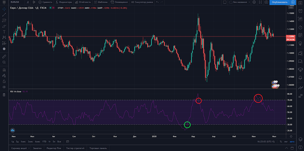
RSI
The RSI or Relative Strength Index shows the overbought and oversold areas of the asset. For example, when the RSI line crosses the level of 70, there is a probability of price reversal downwards, as the growth lasted a long enough period of time and the market needs to correct or change the trend. Falling of the indicator line below level 30 indicates entering the oversold zone, which also means the potential end of the downtrend.
Volumes
Trading volumes are an auxiliary indicator that can tell a trader the potential force of growth or decline. For example, if a trend channel support line or an important price level breaks down at high volumes, it is highly likely that the level will break down and the trend will change. The same situation happens in time of growth. Trading volumes indicate high activity of market participants at the moment, and at the same time, the impulse price movement.
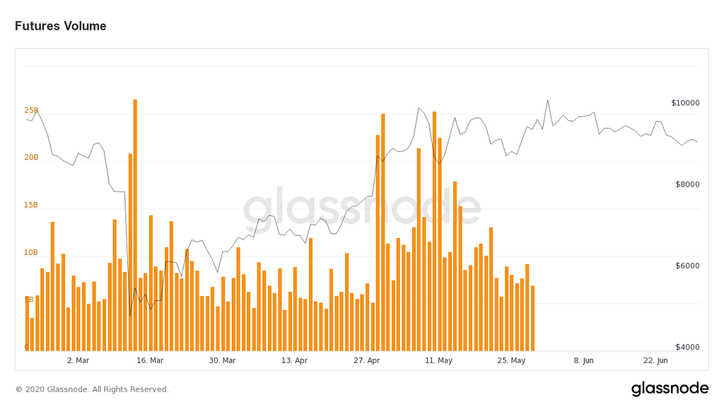
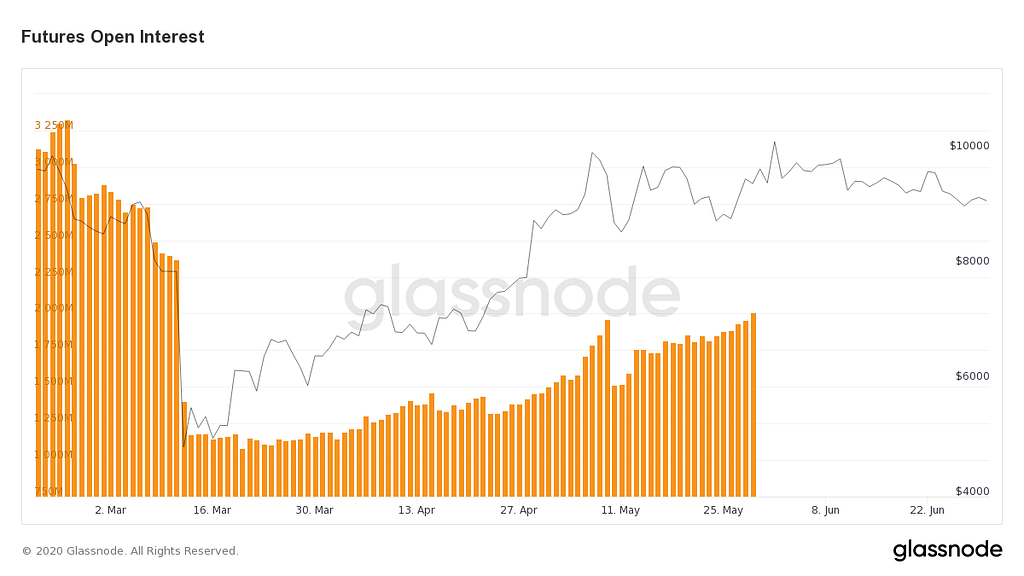
Open Interest
The level of open interest in bitcoin futures on a platform such as CME, has a direct impact on the dynamics of the BTC course. If the level of OI increases, it indicates the activity of large investors and, as a rule, purchases. If the level of OM decreases, the dynamics of BTC rate also falls.
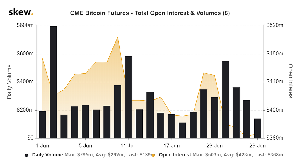
It was particularly visible in May 2020, when the dynamics of the bitcoin (blue line) showed a high correlation with the level of Open Interest at the CME.
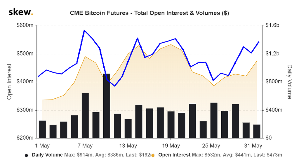
It is worth noting an interesting observation that the level of open interest on cryptocurrency exchanges is very poorly reflected in the dynamics of the bitcoin rate. It is possible to note certain coincidences, but at CME they are much stronger.
Conclusion
The listed indicators, patterns, and observations are only a small part of all existing methods of technical analysis and only the personal opinion of the author of the article, which may coincide with yours or diverge. However, this is probably the main feature of the technical analysis — it is so vast and multifaceted that every trader will find in it the most convenient and understandable indicators that will help him to trade successfully. No matter how much you learn the analysis, you will always discover something new and interesting. As well as 100 years ago, today, this analysis is the main tool of any trader.
Please don’t forget to follow us on Telegram and stay updated!
https://twitter.com/thecapital_io
Technical analysis and its application was originally published in The Capital on Medium, where people are continuing the conversation by highlighting and responding to this story.
from The Capital - Medium https://ift.tt/3fkoSxb


0 Comments